↩ 016. BSDi qfont ↩
Sat, 05 Oct 2024 21:56:06 +0200; go wild
This in many ways mirrors 008. AMIX fonts, sans la fonte du jour est qfont, which has been waiting for a similar length of time (since 2021-07) to get processed thusly.
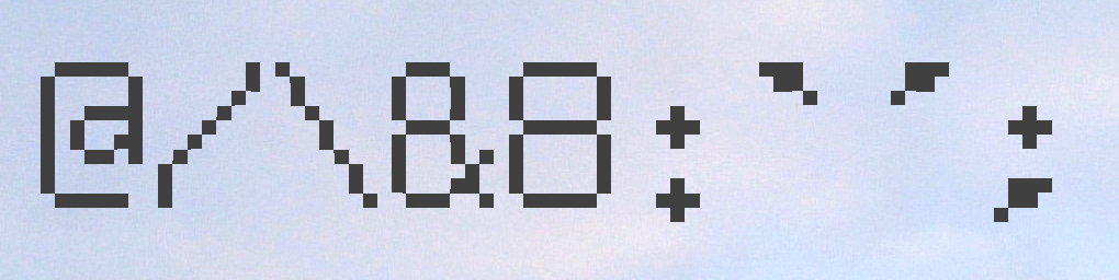
The greatest hits: an overgrown @, asymmetric /\, an offensive & that's clearly just an 8 with a moustache, but an 8 that's nearing double-width, and a heavy set of punctuation (the first one is a `, the second an ').
Full demo, as rendered by libfreetype 2.12.1+dfsg-5+deb12u3/libfontconfig 2.14.1-4.
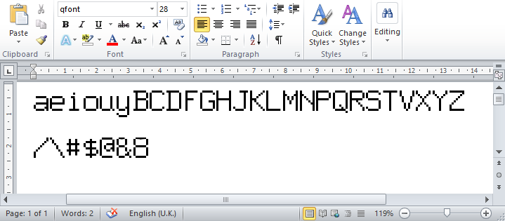
As rendered by WINWORD.EXE.
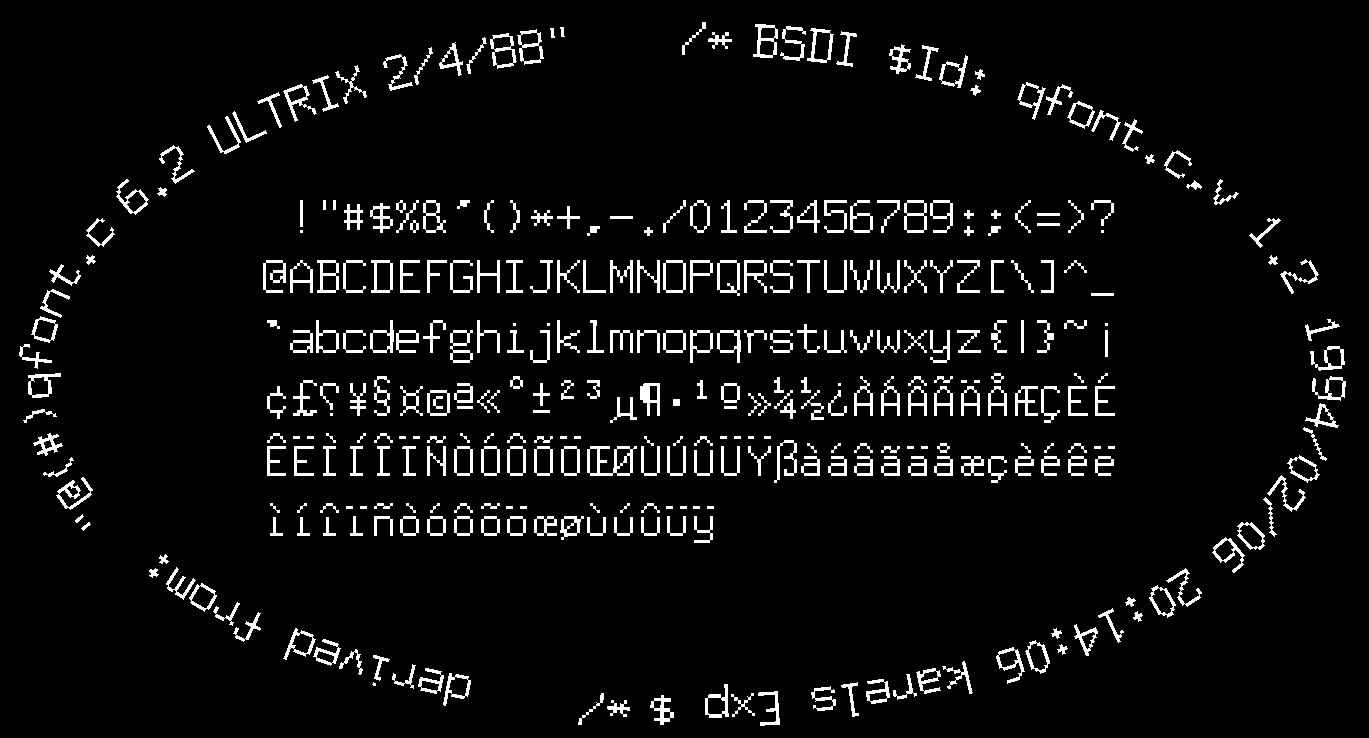
As rendered by Photoshop CS6 (AA disabled).
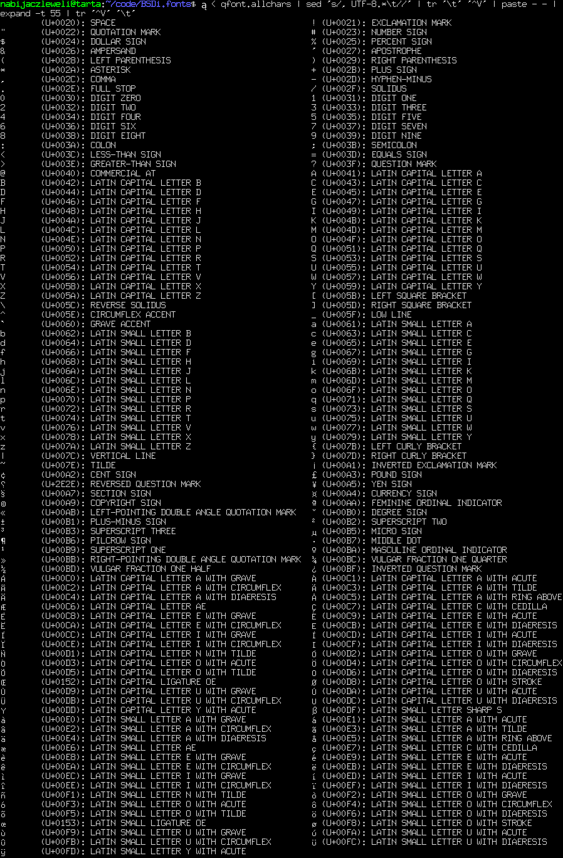
!"#$%&'()*+,-./0123456789:;<=>?
@ABCDEFGHIJKLMNOPQRSTUVWXYZ[\]^_
`abcdefghijklmnopqrstuvwxyz{|}~
¡¢£⸮¥§¤©ª«°±²³µ¶·¹º»¼½¿
ÀÁÂÃÄÅÆÇÈÉÊËÌÍÎÏÑÒÓÔÕÖŒØÙÚÛÜÝß
àáâãäåæçèéêëìíîïñòóôõöœøùúûüý
As rendered by your browser, hopefully.
The procedure can be found here, and is adapted trivially from the AMIX one.
Indeed, much more trivially because the font is in C, so you can just link to it. This C file bears four kilobytes of licence headers (even though bitmap fonts are not subject to copyright protection), and it turns out to be retained in NetBSD as src/sys/dev/qbus/qfont.c (but stamped BSD-3-Clause).
qfont covers 7-bit ascii and most of ISO-8859-1 (with some substitutions). Like previously, it's an art font unsuitable for general use.
The distribution contains:

qfont, a 177-character monospace 8x15px font, with baseline at 12px. (SVG)
The font includes:
- Bitmap strikes at integer increments of [1, 16]x their original size, embedded in their respective OTFs.
- BDFs of all of the above are also exported, if of dubious usefulness.
- The original FontForge .sfd files are also included, for export to other formats.
- Images of the bitmap strikes at all sizes (in PBM P1 format, understood globally by all tooling).
- A montage of all the characters in the fonts (from 4x scale), and an SVG tracing thereof.
- FontForge demo PDFs.
Go wild: https://lfs.nabijaczleweli.xyz/0023-BSDi-fonts/. Built on bookworm.
Nit-pick? Correction? Improvement? Annoying? Cute? Anything?
Mail,
post, or open!